In this post I would like to share parts of a conversation I had with a client on our approach to innovation. While the context of the discussion was improving the design of garage hooks, the ideas are applicable to most types of products.
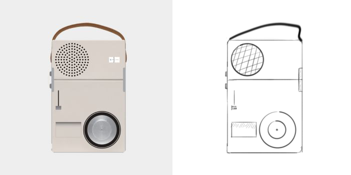
If both software and nature tell us that organic geometries are the most efficient when it comes to material usage, why are we attracted to minimalism?
Some tips for creating parametric models that update as we want them too.
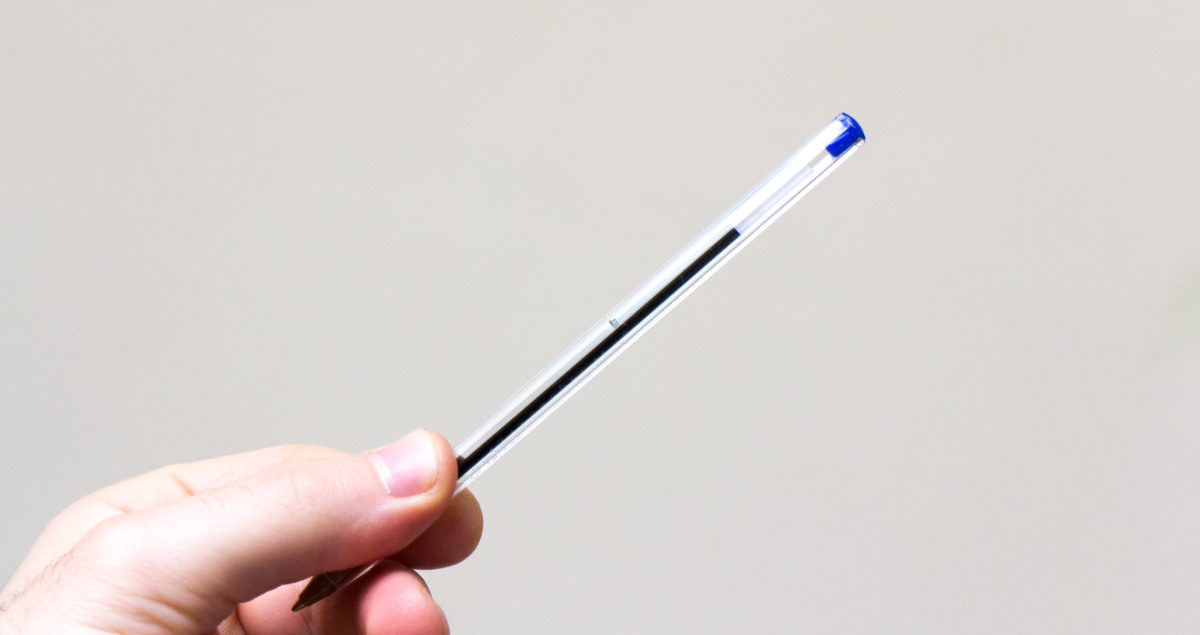
Like a judo master who takes down his opponent using smallest possible movements, these products achieve a lot with little. The BIC Crystal pen is a perfect example of such a product.
In this post I discuss a simple heuristic that I have found useful when designing things.
When I first started using CAD I was amazed by their lack of usability. All the parametric modelling programs I tried felt like relics with bolted on features that made little intuitive sense. The result was that modelling became a drag.
This changed as I discovered Fusion 360.
There is no point in me going over why this is happening. We all use touchscreens and know the ways in which they are awesome. What I would like to spend a second talking about is what we are loosing as we switch to the glass interface.
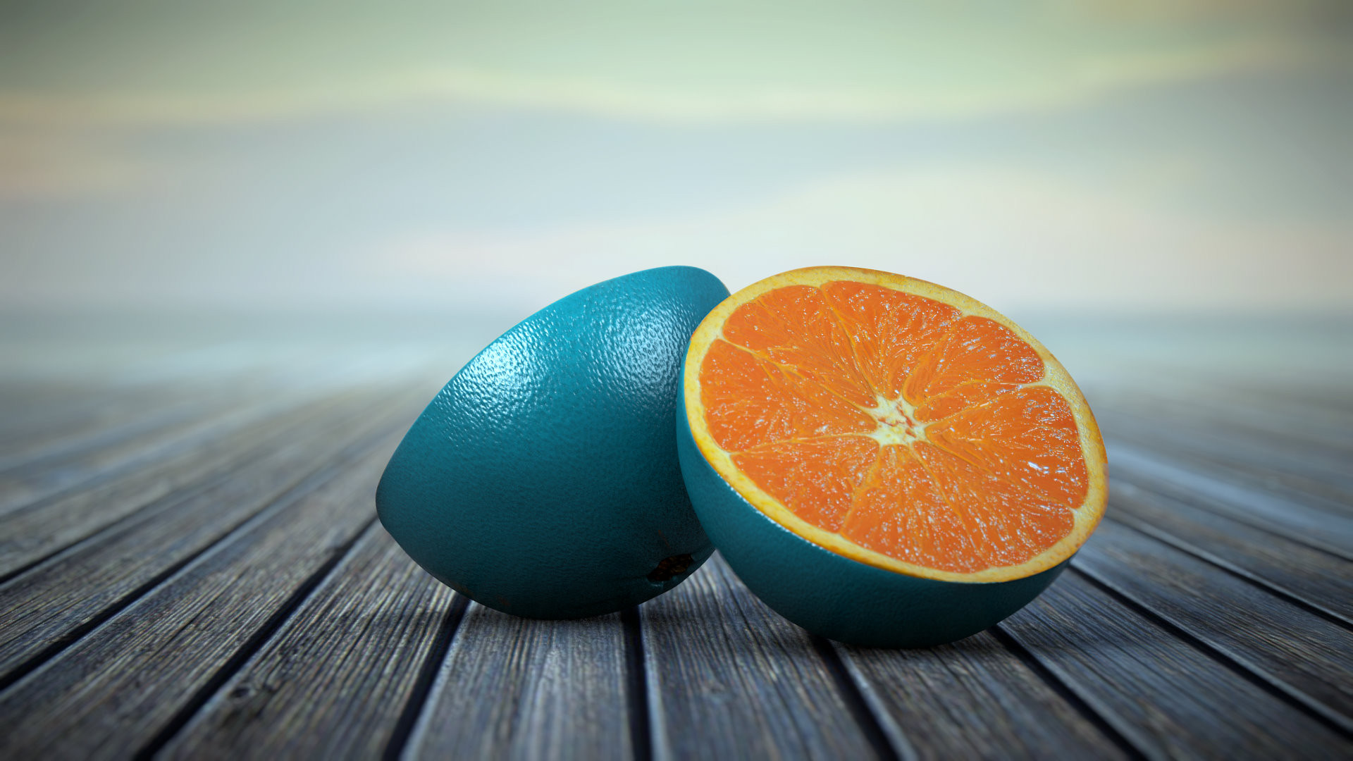
In this post I go over some high level concepts that will help you create photorealistic product renderings.
With the arrival of the digital age our attention spans have dropped significantly. But why are attention spans decreasing, and how to we combat this?
Letting users customize various aspects of their products has progressively become a more common practice. Consumers today often get to choose a multitude of product traits, such as colour, size, texture and tech-specs. Despite all of the great things about customization there are some problems that can appear if implemented incorrectly.
